
What ‘Good’ Looks Like for a Page Layout
Your page layout is all the elements that make up your webpage (like text, imagery, buttons, brand colours) and how they’re structured. It’s not just about how it looks, but how the page functions and guides the user to find what they’re looking for.
Good page layout is important because, on average, you have less than 15 seconds to capture someone’s attention before they click off your site. If a webpage is cluttered and confusing, that makes it difficult for visitors to understand what your site is about, and how to quickly navigate to what they need. This means they’re more likely to get frustrated and leave, which could mean the loss of a potential customer.
That might sound like a lot of pressure, but you don’t need to be an expert in web design to create a decent website. Below we’ll go over what makes a good page layout, show you some examples and share advice on how to choose the best layout for your business.
What makes a good website layout
A good website layout will feel intuitive. It will show the most important information up front, and have a clear, easy to follow navigation. You’ll be able to tell at a glance what it’s about, and it will have imagery or supporting information to reinforce its message and build trust, with a clear action to take next.
Think about websites that you visit regularly. What draws you in? What makes you keep coming back?
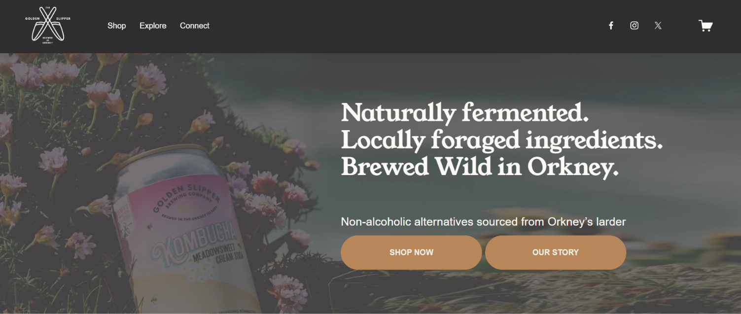
Here’s an example from the Golden Slipper Brewing Company:
Screenshot from Golden Slipper Brewing Company’s Website
On the left they’ve got their logo and then a picture of one of their products, which immediately establishes their brand and what they do (produce kombucha). On the right it explains how and where they do it, and establishes that you can expect locally made, non-alcoholic drinks.
The two buttons underneath the text (which are calls to action) give you two clear things to do: shop, or learn about the company. This is just the first section of their homepage, but without having to scroll they’ve already established who they are, what they do, and what you can expect from this website.
Let’s dig into the best practices to follow for your own webpage layout.
Clear visual hierarchy
This is about where you place the visual elements of your page. The most important information should come first, and then secondary details should follow in a logical order.
One key thing to keep in mind is how people read or process the information on a webpage. They scan, but not necessarily from top to bottom. The most dominant scanning patterns are the ‘F’ or ‘Z’ shapes, which is how the eye tends to skim across a page as the user scrolls.
If you look at the example above, you can see it clearly follows the ‘F’ shape: brand imagery down the left hand side, and two lines of text to summarise what they do out to the right.
Hierarchy is about guiding the user through the page, almost telling them where to look. You can use things like imagery, section headings, icons and bullet points, bold colours and buttons to do this. Keeping things clear and simple is the best way to go.
Prioritise mobile layout
Always keep in mind that your users will be looking at your website on mobile, so it needs to work for both desktop and mobile. This means you might need to customise the layout for mobile view to make it easy to navigate.
Position the menu in expandable sections, remove any elements that rely on hovering a mouse, and simplify the overall page so that it’s quick to load and stacks easily on a smaller screen.
Most website builders have preview screens for both mobile and tablet view, so you can see how it will look.
Keep things simple
A page design that’s clear and uncluttered is easy to look at and understand. It makes it easy for the user to focus on the important stuff, rather than getting distracted by over-complicated designs or unnecessary elements that don’t have a real purpose.
The same goes for the amount of options you give users on a page. If you overload them with too many, it’s harder to make a decision. Each webpage should have a clear purpose, and what goes on that page should support it.
For example, the homepage is the selling point for your business, it should introduce who you are, what you do and make it easy to navigate to your other key pages.
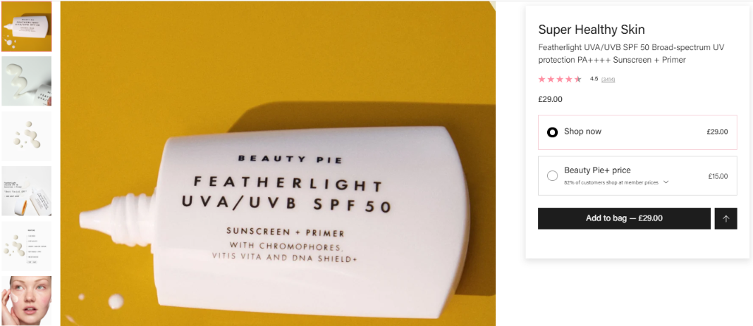
A product page is about selling, so the options you give the user there should be to guide them towards making a purchase. Take a look at this product example from Beauty Pie:
Screenshot from Beauty Pie’s Website
If you want more information about the product, you can click on the arrow to the right, but the layout is geared towards adding it to your bag with one click. It even lists the price on the call to action button to highlight that information at a glance.
Consistent branding
Throughout every webpage, users should get an immediate sense that it’s yours. This means being consistent with your use of colours, font, imagery and logo. This creates a recognisable look and feel, and establishes trust in your brand.
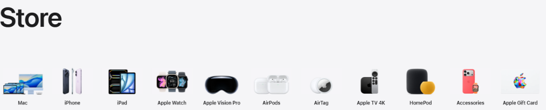
For example, Apple use a minimalist approach with lots of white space across their website:
Screenshot from Apple’s Website
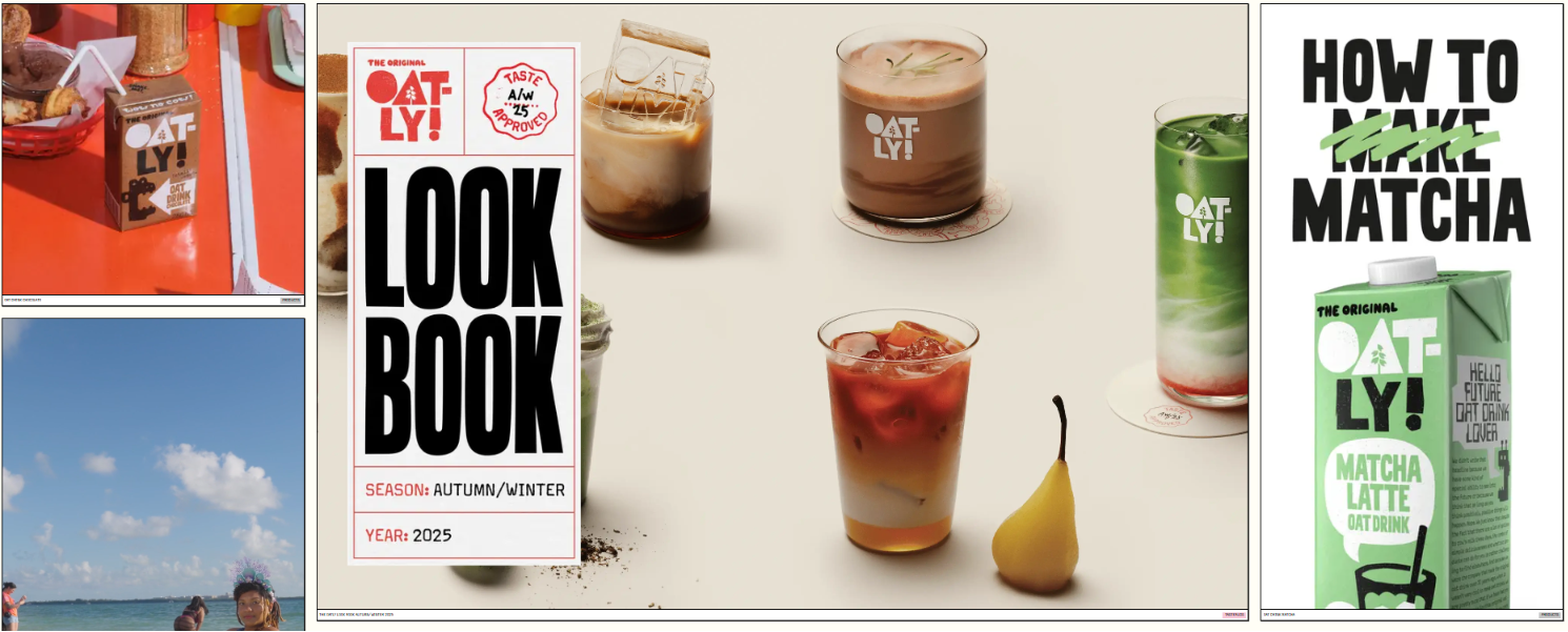
Oatly use a distinctive grid style for their imagery which is consistent throughout their site:
Screenshot from Oatly’s Website
This consistency feels familiar as people navigate through your website, and helps to establish a professional look for your brand, giving the impression you’re reliable and trustworthy.
How to choose the right layout
With all that in mind, the main starting point when choosing your layout is that it should reflect the purpose of your page. Ask yourself what you’re trying to communicate, and what you want your ideal user to do when they arrive on your page.
For example, if you’re an artist looking to showcase your work then choosing a layout that’s very visual and structured like a portfolio would be a great choice. Or, if you’re selling your services then having sections for customer reviews to establish trust might be an important focus point.
If you’re building a page from a pre-made template, the chances are a lot of the work has been done for you. It’s important to spend time refining it though to make sure you only include what you need, and that it communicates all the right things.
Above all, keep things simple. Try and look at your page through a user’s eyes and test out the overall experience. If it feels overwhelming, or confusing, then take a step back and revise it.
Once you’ve decided on the layout, the next thing to focus on is SEO to make sure as many people as possible can find your page. Read our blog about the fundamentals of on-page SEO to get your website visible in Google search.
